Mobile gaming has exploded over the last decade, with slot games becoming a staple entertainment option for millions worldwide. But anyone who’s tried playing these games on their phone knows that some titles feel visually overwhelming and difficult to navigate. UI clutter, too many buttons, and tiny text are common complaints from users struggling with the small-screen experience.
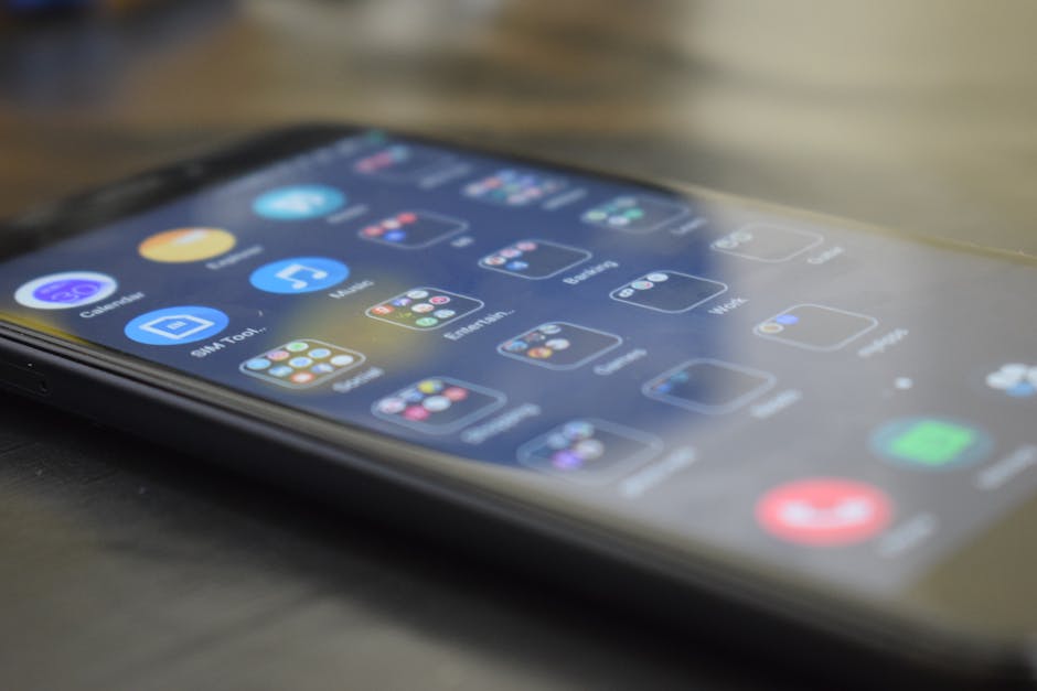
In this deep dive, we’ll explore why slot games often feel cluttered on mobile devices. From the challenges of designing for small screens to the quest for visual hierarchy and readability, we’ll unpack how mobile slots build distinct visual worlds—and sometimes trip over practical constraints. We'll also look at how elements like color, typography, iconography, and animation influence recognition and usability in these interfaces, especially when delivered through mobile browsers and responsive presentation techniques.
Designing for Small Screens and Constraints
When slot games originally emerged on desktops and physical machines, they enjoyed large-scale displays and a generous interface real estate. Mobile screens, however, average around 5 to 6 inches diagonally, creating an inherent tension in UI design.
The Core Problem: Limited Space
Designers must fit controls, game reels, pay tables, promotional messages, balances, and more into a very restricted space. This causes two main issues:
- Competing elements crowd the screen: Operators want to show players as much information and monetization features as possible at once, resulting in jam-packed layouts. Reduced tap targets: Too many buttons can lead to tiny, difficult-to-tap controls, frustrating users and increasing input errors.
From a UX perspective, the core question always is: What is the user trying to do right now? In mobile slot play, most users want to quickly spin the reels, see their balance, and understand their recent wins or bonuses. Yet designers often layer secondary features like leaderboards, chat, promotional pop-ups, and elaborate settings menus directly on the main screen, causing clutter.
Responsive Presentation—A Blessing and a Curse
Most mobile slot games are now delivered via mobile browsers or hybrid apps that rely on responsive web design principles. While responsiveness makes the games accessible on varying screen sizes, it can exacerbate layout problems:
- Scaling down desktop assets: Sometimes UI elements designed for desktop simply scale down, making buttons and text too tiny for comfortable mobile use. Hidden or condensed navigation: Hamburger menus or tabs may hide key controls, confusing users unfamiliar with these patterns. Multiple UI states: Responsive interfaces often require users to tap to expand or close sections, increasing the number of taps and potentially leading to disorientation.
Counting taps in some games easily reaches 7 or 8 just to start a spin, making the experience feel cumbersome.
Visual Hierarchy and Readability
The foundation of any clean UI is clear visual hierarchy—guiding the user’s eye effortlessly through the most important elements first. Mobile slot games face the challenge of simultaneously displaying game reels, buttons, bet info, and animation explosions, often compromising clarity.
Tiny Text Hurts More Than Just the Eyes
It's common to see text in slot games shrunk down to fit cramped layouts:
- Balance amounts and bet values in fonts smaller than 10px, difficult for older users or those playing on smaller phone models. Paytable descriptions with tiny typography that users have to pinch-zoom to read. Menu labels and tooltips that vanish into the background due to inadequate contrast or size.
This tiny text isn’t just an accessibility issue. It leads to users missing vital information, such as how many paylines are active or what bonuses they've unlocked, ultimately impacting trust and engagement.
Color and Contrast—Power Tools for Hierarchy
One common method mobile slot designers use to organize clutter is recognition via color. Bold, contrasting color blocks highlight spin buttons, jackpot meters, and notification badges. However, overuse of bright colors and flashing animations without clear priority can turn the UI into a chaotic mess.
Effective hierarchy means pairing color with strategic use of whitespace and positioning. For example:
- Primary action buttons (e.g., “Spin”) should always have the highest visual weight. Balance and credit info should be noticeable but secondary—often positioned top center or top left. Promotions and chat windows ought to be accessible but should never overlap core gameplay controls.
Mobile Slots Developing Distinct Visual Worlds
Every slot game tries to create a unique theme or aesthetic universe—from ancient Egyptian tombs to neon cyberpunk to lush jungles. This art direction heavily influences UI styling and control placement.
Tradeoff Between Theme and Usability
The more a slot game leans into an immersive visual world, the more its UI risks becoming decorative noise:
- Backgrounds with intricate detail reduce contrast for overlaid text. Themed iconography sometimes replaces standard currency or spin symbols, confusing quick recognition of function. Animations meant to enhance theme often obscure buttons temporarily, creating frustrating delays on touch interaction.
The challenge lies in achieving a balance—supporting strong storytelling and branding without sacrificing legibility or interaction efficiency.
Recognition Through Iconography and Animation
Icons play a critical role in reducing text reliance, speeding recognition, and decluttering UI:
- Consistent icon use: Standard symbols for “spin,” “autoplay,” or “bet max” help users navigate quickly. Animated feedback: Bounce or glow effects on buttons signal interactivity, but excessive movement can overwhelm the senses.
A UX critique habit: Always check whether animations block or delay access to essential controls. If the “Spin” button is flashed wildly for 3 seconds before it becomes tappable, users might abandon the game out of frustration.
Why UI Clutter, Too Many Buttons, and Tiny Text Persist
Given these challenges, why do developers still launch slot games that feel cluttered? Several factors contribute:
Monetization pressure: Operators want to surf multiple revenue streams, from in-game purchases to ads and cross-promotions, pushing extra overlays and buttons. Legacy design practices: Many slot games started as physical or desktop versions and only later migrated to mobile, carrying over dense interfaces. Marketing and branding: Constant style shifts and brand activations demand visual prominence on every screen, overriding interaction consistency. Tech limitations of mobile browsers: Responsiveness is often “bolted on” rather than designed natively mobile-first, limiting layout flexibility.This combination means users often face a canyon of UI overload before they can even engage with the core gameplay loop.
Improving Mobile Slot UI: Best Practices
Based on years of UX writing and design critique across mobile entertainment interfaces, here are some recommended strategies to combat clutter in mobile slot games:
- Prioritize core user tasks: Ensure the spin button, player balance, and recent wins are always prominently and accessibly displayed. Limit buttons visible on main screen: Use expandable menus rather than crowding every feature upfront. Use legible typography: Minimum font sizes of 14px for critical info, with clear color contrast against backgrounds. Optimize animation timing: Keep UI animations short and non-blocking. Consistent iconography: Use universally recognized icons for standard controls, reinforced with optional text labels. Test tap targets and screen states: Aim for buttons sized at least 44x44 pixels and track tap counts needed for typical actions. Responsive design done right: Design fluid layouts that reflow elements logically rather than merely shrinking or hiding content.
Conclusion
Slot games on mobile have unique UX challenges driven by small screen constraints, monetization goals, and immersive visual theming. The consequent UI clutter, too many buttons, and tiny text degrade user experience, making gameplay frustrating rather than fun.
By focusing on clear visual hierarchy, prioritizing user intentions, employing consistent color and typography standards, and respecting mobile interaction best practices, designers can build slot games that delight players without overwhelming them. Mobile browsers and responsive technology offer powerful tools—but only Visit this website when used thoughtfully to serve clarity over chaos.

Next time you feel visually bombarded playing a slot game on your phone, remember: it likely wasn’t built with the mobile player’s needs as the first priority. With better focus on usability, mobile slot experiences can still be a winning spin.